Cotswold Stone Fireplace

Today we have an amazing choice of products off-the-shelf that can be delivered to our door the very next day. However, sometimes we do want something different; thoroughly distinctive and definitely individual. Crown Construction Solutions have provided many one-off features for clients and they are consistently delighted by the results.
Fireplace

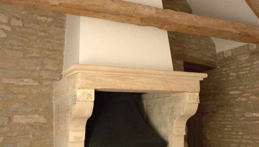
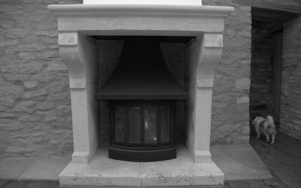
Starting with an old open fireplace the team removed all elements of the previous chimney and fireplace structure. The fireplace had been constructed as a later addition to the property and had been constructed of standard Cotswold walling stone. Unfortunately, the contractor who fitted it used Portland cement which not only cracked as it dried but also because of slight movements in the building; old buildings do move! Cement also is distinctively grey in colour which is not a good match for Cotswold stone.

A design was worked on with the clients and then the Bath stone was sourced from reclamation yards to provide an authentic look. Some stones had to be cut to meet the design requirements and the mantel piece, that could not be found elsewhere, were crafted beautifully by the team at Farmington Stone. The client provided an old but large wood burning stove that they had brought with them from their previous property and felt it would be suitable for the new fireplace.

After two weeks onsite the new fireplace was ready to be photographed and lit for the first time. It has been great to experience the process of developing design ideas, sourcing the materials from a range of suppliers and then installing the fireplace. The fireplace will remain a significant feature in this barn conversion for many, many years to come and provides a commanding feature that is very unique.

Would you like to create a stunning Cotswold stone fireplace for your home?

Apartment Redevelopment

Adding Some Colour in Notting Hill, London

A beautiful apartment in Pembridge Gardens untouched for nearly 25 years

Designer: Tom Sandman

Construction: Crown Construction Solutions

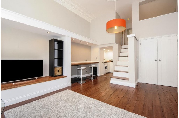
Introduction: This project was a real challenge because small properties always are. The Crown Construction (CCS) team had an outdated apartment that needed a new look, light, colour and a whole new perspective in order to try and achieve almost double the rent for our client. The first challenge was to design a new layout within the existing studio apartment theme; a responsibility taken on by Tom Sandman who now has a number of internal redesign projects to his name. And the second was to construct the new elements within the limitations of the room.

Client’s Comments: dealing with Tom Sandman and the team at Crown has been a very positive experience. As with any building project many decisions have to be made and Toms’ support and ideas have saved us from making mistakes and wasting money. Communication throughout the project was very clear and reliable. Every week I knew what had happened and what was going happen, which was very reassuring. I also had regular emails with the latest photographs so we could see what progress had been made. I’ve never worked with a building firm that goes that far to keep their customer informed. My wife and I still cannot believe what has been achieved. We are absolutely blown away by the level of finish and attention to detail. Would we recommend them to others? Most definitely and we’re already talking to Tom and his team about another project.

Client Feedback Video

Tom’s viewpoint: ‘whilst we had the basic layout in place it was important to make this apartment feel more like a ‘mini’ boutique hotel rather than a ground floor flat which is how it was marketed before. It had to have broad appeal so that it would rent quickly but it also needed to be different. Before going into the apartment for the first time, I visited all the letting agents locally to see what was on offer. What struck me, more than anything else, was that every apartment on offer was painted in white or one of many shades of cream. Whilst this might be suitable for a modern box it did not seem right for a building with 3.8mtr ceiling heights and a 1.25mtr ceiling rose; some colour was essential so the Farrow and Ball colour chart became my my new guide.

The first thing I wanted to design was a feature within the living area that helped make the apartment feel more cosy, plus I wanted to divide the area up a little to provide a breakfast bar. The kitchen is so small that more work surface would be essential to make the living here more practical and enjoyable. Please see the initial sketch I drew in order to understand how I solved the issues mentioned. The sketching process is important because it allowed me to communicate in very few words to my client, who lives in Bath, just what I had in mind regarding the redesign. I produced over 80 sketches throughout the course of the redevelopment and shared about 10 with my client to communicate my intentions for their property.

The other areas we addressed as part of this development was a redesign of the limited wardrobe space – this became a double door walk in wardrobe; the bathroom needed to be bright and modern; the sleeping platform was similar to a parcel storage area rather than somewhere to sleep; the kitchen lacked everything including a modern boiler so we stripped it out completely and started again.

Overall the project came in over budget because the extent of the refurbishment was slightly underestimated. But the quality of finish and overall feel of the apartment surpassed the clients expectations so much so that he wanted to produce a video for our website to explain the benefits of working with the CCS team. The project had its challenges and now they have all been resolved one lucky person has the delight of living in a room crafted with care and real attention to detail’.

If you have a similar project and would like some input on how to redesign a space please do give Tom or Erol a call.

Bibury Barn Conversion

Bibury Barn Conversion (Part 1)

A beautiful barn development in Bibury, Gloucestershire
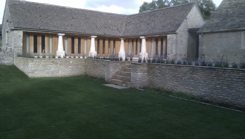
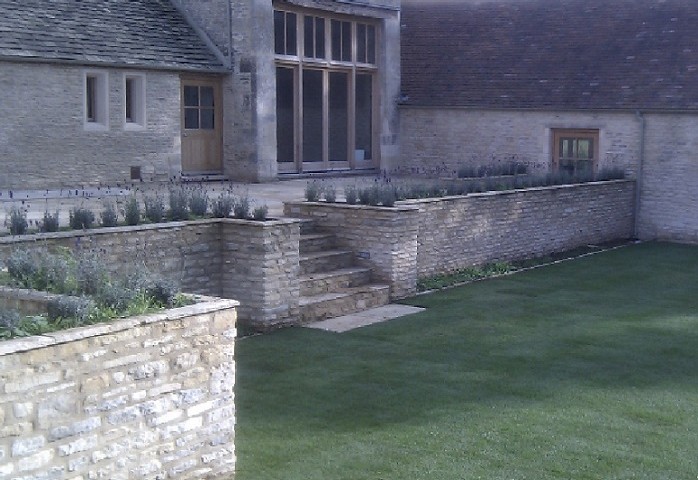
It was our aim to redevelop this barn in a way that sympathetic to its surroundings and create a contemporary home from a building that had been neglected for so long. In particular all but one of the barn pillars had crumbled away and as you can see from the photographs the team was able to recreate new pillars from Cotswold Stone with the help Farmington Stone.

The design of the exterior was down to the client and represented exactly what they wanted to achieve.

Whenever we are asked to complete a barn conversion we try and stay true to the heritage of the building so that the historic features and form remain for many years to come.


Berkeley Square

Apartment Redevelopment for Famous Spy and Cold War Author…

This was no ordinary apartment redevelopment because the team were working with a well known author who had some very specific requirements that needed to be included in the final building design and finish.

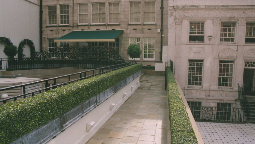
Specific elements included bespoke inlay wooden cabinetry, new solid Rosewood doors 70mm thick and requiring 4 staff to fit each one, new ceilings with intricate coving, install a man-made hedge to provide privacy all year round for the outdoor terrace (no maintenance); handwoven carpets in the main living area from Scotland; stipple painting effects in a client requested pattern to provide the illusion that wallpaper had been used; silver leaf decoration on select walls, and the list could go on and on. This project was all about precision, finish, and quality; the client was a delight to work with and we are now the apartment maintenance team should anything require updating in the future.

If you own a prestige development and would like a reliable contractor to manage your space then please do give us a call.

Bibury

Bibury Barn Conversion (Phase 2)

Another beautiful barn to development in Bibury, Gloucestershire
It was our aim to redevelop this barn in a way that sympathetic
to its surroundings and create a contemporary home from a
building that had been neglected for so long.

Once both phases were complete we knew the entire site would
feel different; we had converted a tired and neglected
collection of buildings and united them into something very
special.

Ampney Crucis

Estate Machinery Storage

Ampney Crucis, Gloucestershire
Our client is a publish architect with a keen eye for detail and
a real understanding of what to expect from the onsite team. It did
long for us to establish ourselves as team that did not require
supervision so we were left alone to develop the site.

We constructed a long row of garages into the hill of this estate
ensuring the building could not be seen from the house. The building
also contains a glass front plant room where they can be kept out
of way of frosts during the worst of the winter weather.

The extended frame and pits to the front of the building are there
to allow for climbers to be planted this summer which will help anchor
this whole development into the estate’s natural surroundings.