Apartment Redevelopment
Adding Some Colour in Notting Hill, London
A beautiful apartment in Pembridge Gardens untouched for nearly 25 years
Designer: Tom Sandman
Construction: Crown Construction Solutions
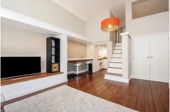
Introduction: This project was a real challenge because small properties always are. The Crown Construction (CCS) team had an outdated apartment that needed a new look, light, colour and a whole new perspective in order to try and achieve almost double the rent for our client. The first challenge was to design a new layout within the existing studio apartment theme; a responsibility taken on by Tom Sandman who now has a number of internal redesign projects to his name. And the second was to construct the new elements within the limitations of the room.
Client’s Comments: dealing with Tom Sandman and the team at Crown has been a very positive experience. As with any building project many decisions have to be made and Toms’ support and ideas have saved us from making mistakes and wasting money. Communication throughout the project was very clear and reliable. Every week I knew what had happened and what was going happen, which was very reassuring. I also had regular emails with the latest photographs so we could see what progress had been made. I’ve never worked with a building firm that goes that far to keep their customer informed. My wife and I still cannot believe what has been achieved. We are absolutely blown away by the level of finish and attention to detail. Would we recommend them to others? Most definitely and we’re already talking to Tom and his team about another project.
Client Feedback Video –
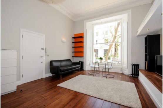
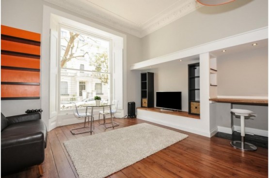
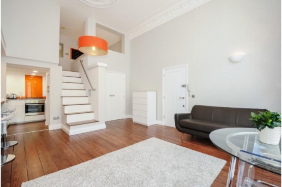
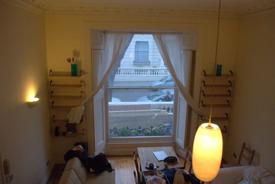
Tom’s viewpoint: ‘whilst we had the basic layout in place it was important to make this apartment feel more like a ‘mini’ boutique hotel rather than a ground floor flat which is how it was marketed before. It had to have broad appeal so that it would rent quickly but it also needed to be different. Before going into the apartment for the first time, I visited all the letting agents locally to see what was on offer. What struck me, more than anything else, was that every apartment on offer was painted in white or one of many shades of cream. Whilst this might be suitable for a modern box it did not seem right for a building with 3.8mtr ceiling heights and a 1.25mtr ceiling rose; some colour was essential so the Farrow and Ball colour chart became my my new guide.
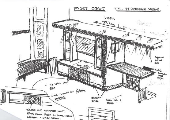
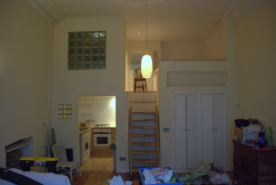
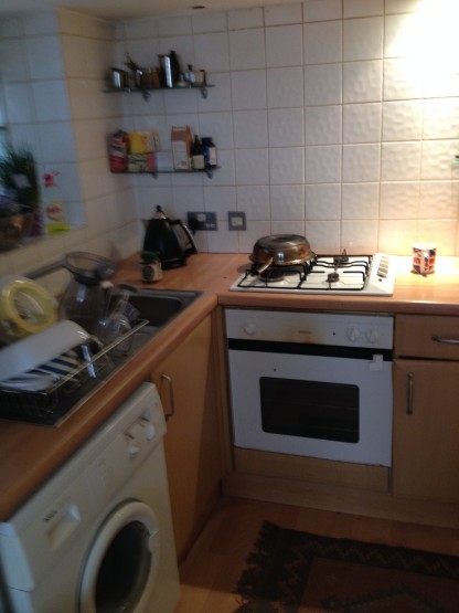
The first thing I wanted to design was a feature within the living area that helped make the apartment feel more cosy, plus I wanted to divide the area up a little to provide a breakfast bar. The kitchen is so small that more work surface would be essential to make the living here more practical and enjoyable. Please see the initial sketch I drew in order to understand how I solved the issues mentioned. The sketching process is important because it allowed me to communicate in very few words to my client, who lives in Bath, just what I had in mind regarding the redesign. I produced over 80 sketches throughout the course of the redevelopment and shared about 10 with my client to communicate my intentions for their property.
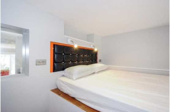
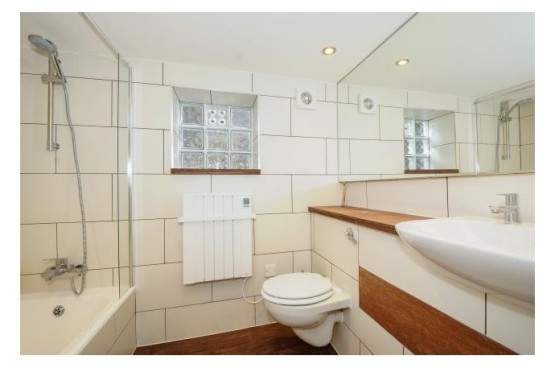
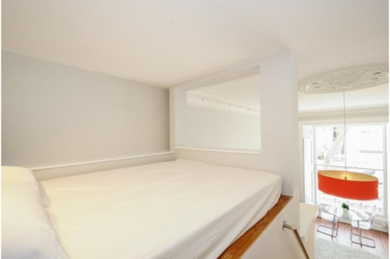
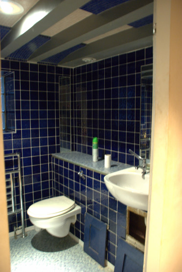
The other areas we addressed as part of this development was a redesign of the limited wardrobe space – this became a double door walk in wardrobe; the bathroom needed to be bright and modern; the sleeping platform was similar to a parcel storage area rather than somewhere to sleep; the kitchen lacked everything including a modern boiler so we stripped it out completely and started again.
Overall the project came in over budget because the extent of the refurbishment was slightly underestimated. But the quality of finish and overall feel of the apartment surpassed the clients expectations so much so that he wanted to produce a video for our website to explain the benefits of working with the CCS team. The project had its challenges and now they have all been resolved one lucky person has the delight of living in a room crafted with care and real attention to detail’.
If you have a similar project and would like some input on how to redesign a space please do give Tom or Erol a call.

